A new look. A new chapter.


The last time Modern Milkman had a new look was 2021. Back then, we were a fast-growing startup doing one thing: bringing back the milkround for people who cared about what they bought and where it came from. The brand reflected that. Clean, friendly, straightforward.
A lot has changed since then.
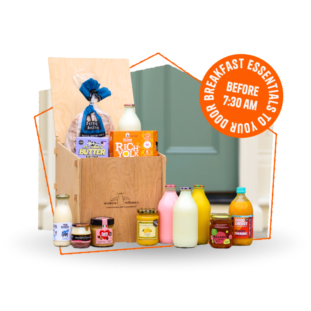
We now run milkrounds across the UK. We’ve expanded into the US. The service that started with a pint of milk and a dozen eggs now covers everything from overnight oats to sourdough, chorizo jam to British cheese, sourced from independent makers and delivered to your doorstep by 7.30am, three times a week.
We needed a brand that could hold all of that.
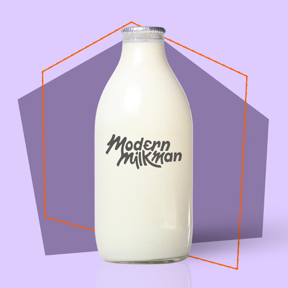
So we started work alongside a design agency calked AgencyTK, to create our new logo, colours and fonts. But more than a visual refresh, it was a chance to ask some bigger questions. What does Modern Milkman actually stand for now? What do we want to say out loud? The milkround philosophy had always been broader than milk. We just needed the brand to say so.
The new identity is grounded in that. It reflects the people who work here, the suppliers we partner with, and the stories we have a right to tell. Stories about provenance, quality, impact and convenience, about a different way of doing things.
So a new look, a new service, and a clearer sense of where we’re going.
We hope you like it as much as we do.
Modern Milkman team